Hey everyone, this is going to be my first how-to blog. I will try my best to cover every single detail or point to a resource so that your doubts get cleared. Without any due, let's get started.
Today we will be covering how to animate a button as below using only CSS. This will be short and straightforward to implement, but before we start, I expect you to have a basic idea about HTML and CSS, like how to write basic markup and how CSS selectors work. If not, you can go through this playlist by Kevin Powell.

HTML
We need to add a button in the body in your index.html file, as shown below.
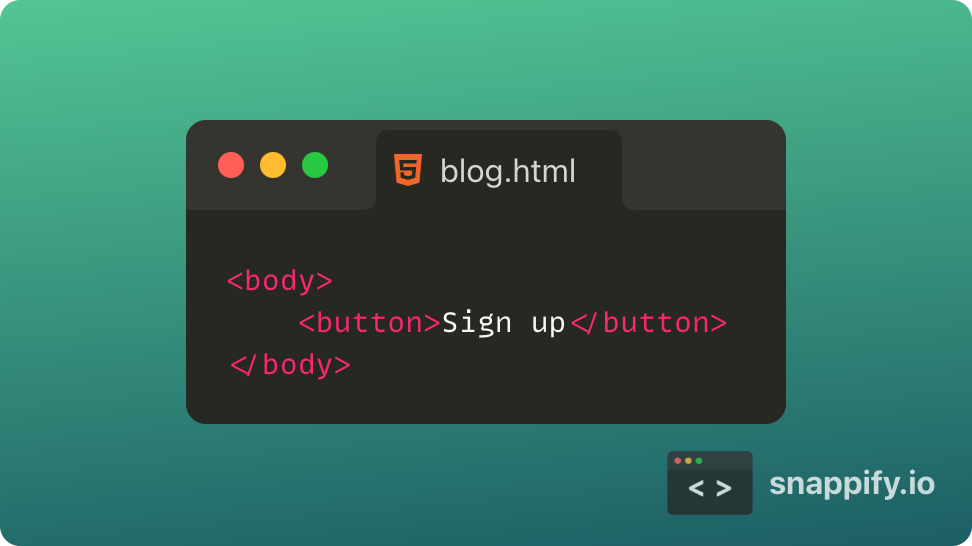
If you aren't on a CodePen, you will need to link your stylesheet section. I will use the Montserrat font family to style the text in the button, and I got it from Google Fonts. You can use your favorite font from Google fonts but don't forget to include the required lines in the section.
CSS
Let's now start CSS for this.
Body
First, let's add the background color and font family by selecting the whole body. We can use either the background or background-color property to set the color for the background. I randomly chose a theme from Coolors and used #ffe8d6 as the background color. For the Font family, we will use font-family property to set the font to Montserrat, and we will add sans-serif as the fallback font.
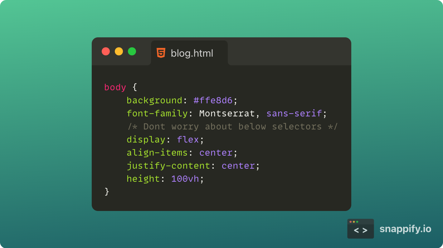
We will also center the button for more visibility using the display property set to flex. If you have no experience using flexbox, you can ignore these for now, or check out this 15 min video by Web Dev Simplified for understanding. It is going to be a bit tricky at the start and to get the hang of it.
Button Rest state
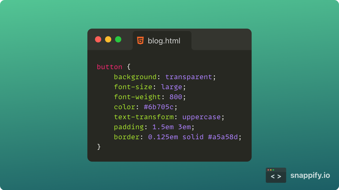
Now let's get to styling the button. First, let's remove that ugly background by setting background property to none or transparent. Then, increase the font-size to large for visibility and put the font-weight to 800. Set the color property to #6b705c, which sets the font color. Let's make font to all CAPS by setting text-transform property to uppercase. Now let's add some padding and border to the button, as shown below.
Button Hover state
We have now coded the rest state of the button. Let's now code the hover state of the button.
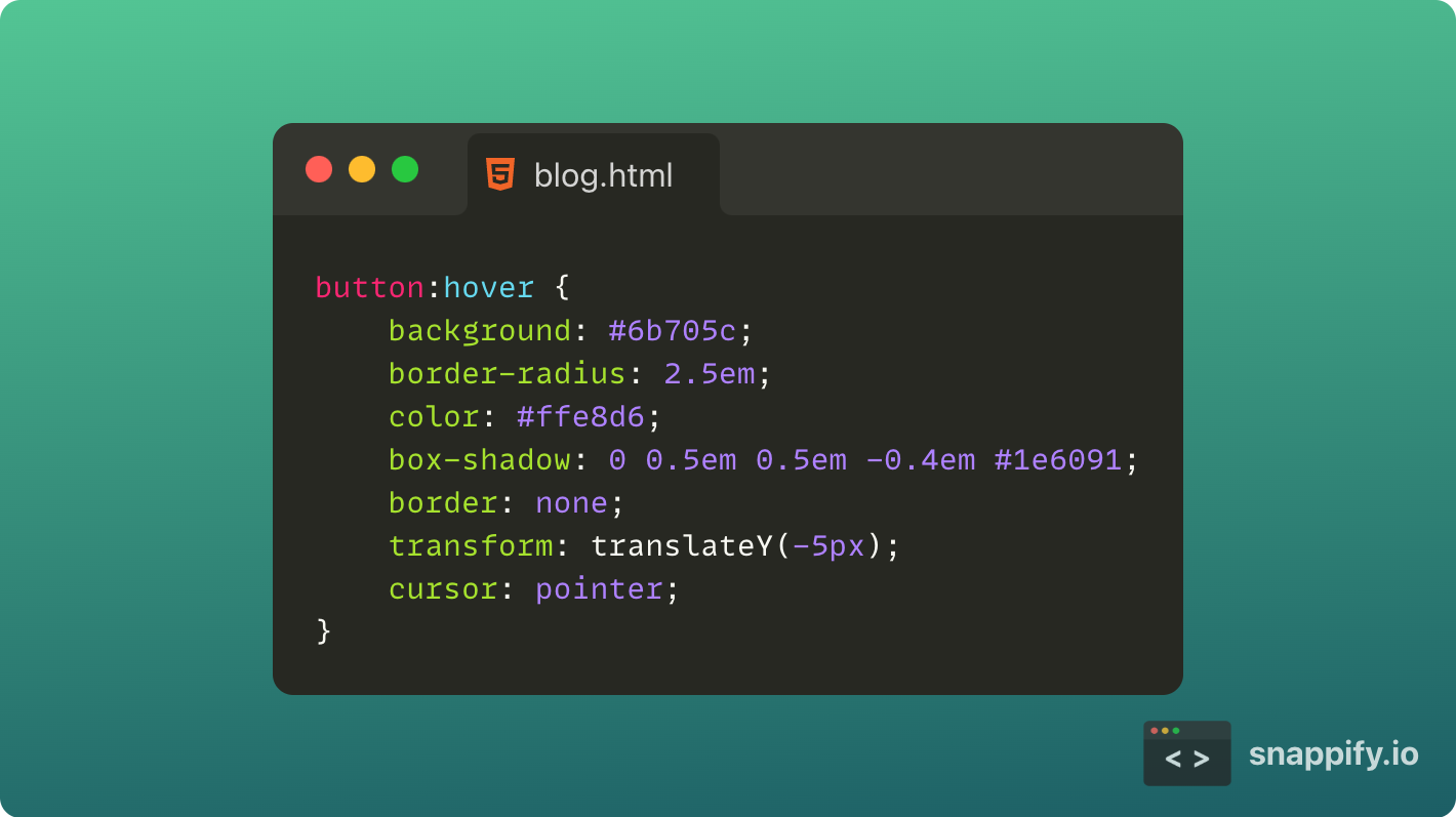
For this, we will use a pseudo-class called hover. Hover Styles can be applied for an element by adding :hover syntax to the end of the selector.
We will be changing the background to a darker color to intimate the selection. We will use #6b705c as the background to the button. We will also change the font's color using color property to #ffe8d6(a lighter shade) to make it readable. We will add a border-radius to create rounded corners for the button. You can keep or remove the border. But I removed it so that it would give a cleaner animation. We will now shift the button up a bit to give the feeling of the lift. We will do this using the transformproperty and set it to translateY(-5px). We will also add shadow using box-shadowproperty. For more details, check out this MDN page about box-shadow. We will also set the cursor to the pointer to show the hand symbol instead of the arrow we get.
Button Transitions
Now the before and hover styles are done but, it is too snappy. So we will add some transitions to make it smooth and satisfying.
We will use the transition property to set the timings and time functions. For more details, check out this page from MDN.
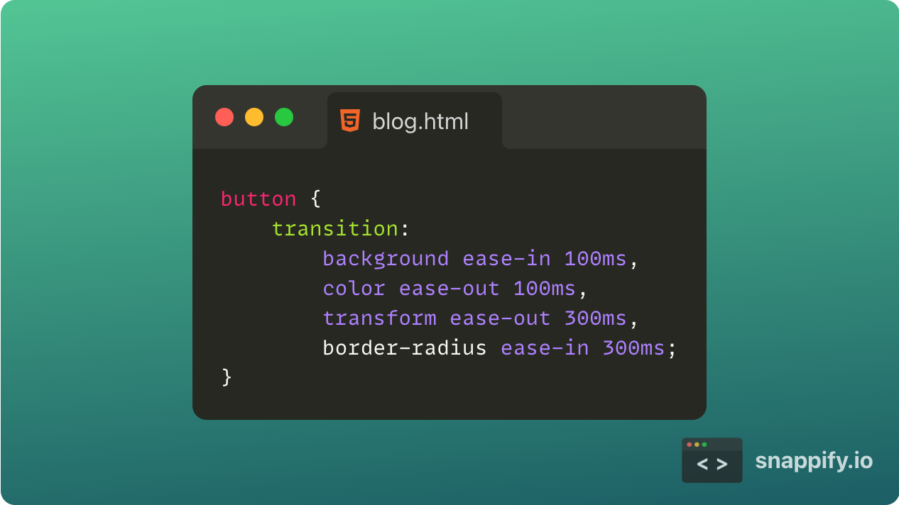
Now it should look pretty good and snappy. If you have any doubts, check out my CodePen of the above tutorial, so you can play around with the timings and colors to make your own.
Was this a helpful blog? and did you learn something new?
Comment down below! 👇
And don't forget to give feedback about the blog down below.
Thanks for reading till the end, and see you in the next one!
Cover Photo by KOBU Agency on Unsplash